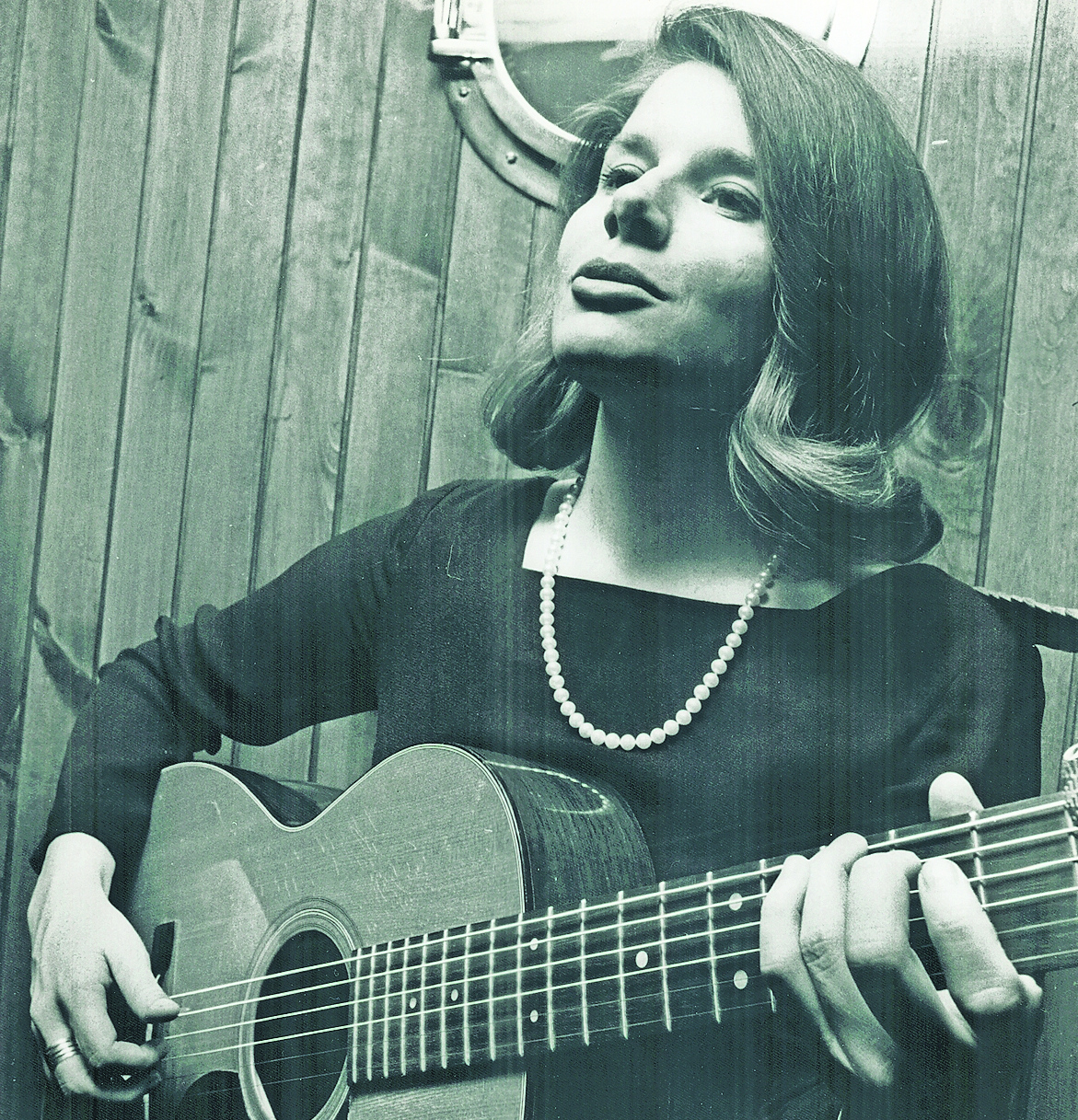
The lost lady of folk loved by Robert Plant
In 2002 I did an interview with Robert Plant in which he enthused about a folk song of apocalyptic warning called Morning Dew. The ballad, Plant said, was written by the American songwriter Tim Rose, but the best version was by a Canadian habitué of the early Sixties Greenwich Village folk scene called Bonnie Dobson.
I was sure Plant was wrong and that the mysterious Dobson was in fact the writer of Morning Dew — one of the most haunting songs of the Cold War era, since covered by the Grateful Dead, the Allman Brothers and Plant himself. But it was hard to prove because Dobson was the ultimate lost lady of folk. She made a handful of great albums in the Sixties and Seventies, including 1970s classic Good Morning Rain, before disappearing.
Still, I did my best to set Plant straight.
“So it was you,” says Bonnie Dobson, a remarkably youthful 84-year-old in tasselled mukluk boots, from her books, paintings and photographslined living room in Primrose Hill, north London. It turns out that Dobson has been in Primrose Hill since 1969, living alone after her architect husband, Andrew, died in 2014. “In 2013 Robert Plant asked me to sing Morning Dew at a tribute to Bert Jansch, so he was giving it back to me. Tim Rose stole my song.”
It had never occurred to Dobson to copyright Morning Dew. In 1964 she was told to publish it because her fellow folk singer Fred Neil wanted to record a version, but by then Rose had already claimed it as his own.
“He also claimed to write Hey Joe, so he was a serial song stealer. It got annoying, having to explain to everyone that I wrote it. I never met the guy, and then in 1998 he was playing the Half Moon in Putney.
After he did Morning Dew to huge applause, I shouted, ‘How about giving credit to the person who wrote it?’”
Rose, thinking on his feet, invited Dobson on stage with him. “And I shouted, ‘I wouldn’t get up on stage with you if it was the last thing I do!’”
Morning Dew was the first song Dobson wrote, aged 19. In 1961, after playing the Ash Grove club in Los Angeles, she got into a gloomy conversation with friends about the impending likelihood of nuclear Armageddon. Everyone present had seen On the Beach, the 1959 film about the aftermath of nuclear war. “This was before the Cuban missile crisis but everyone was scared. I was staying at a friend’s house, so I sat up one evening and wrote the song.”
That was 65 years ago. Now Dobson has made an album of plangent, keening country rock and folky blues with the Hanging Stars, a much younger five-piece she met through an acoustic scene centred around the Betsey Trotwood pub in Clerkenwell in London. It marks a long-awaited second act in a career that could have been as glittering as that of Joan Baez or Joni Mitchell.
Morning Dew was not Dobson’s only great song. Good Morning Rain is a gem of sweet melancholy; Winter’s Going is a tale of murderous revenge by a scorned lover, and it sounds like an ancient folk ballad. A contemporary of Bob Dylan and Pete Seeger, Dobson was described in the 1962 Philadelphia Folk Festival programme as “Canada’s gift to the United States”. Then she disappeared. What happened? “I fell in love,” Dobson says on why she came to England in 1969, never to return to North America. “It was one of those whirlwind transatlantic romances, which I don’t advise, but then I had two kids and there’s no way you can be off on the road. I decided to finish that degree I never completed back in Toronto instead.”
Dobson took a politics, philosophy and history degree at Birkbeck College in London, where her professor asked if she would stand in as a philosophy administrator after the last one walked out. “I had never done a job in my life!
But I knew how to file, I knew the people on the course, and by the time I left in 2007 I was running the faculty of arts and organising conferences.”
Dobson’s first return to the stage came that year, when Jarvis Cocker curated the Meltdown festival at Southbank Centre and convinced her to come out of retirement.
“That was quite a concert,” she says. “My kids had never seen me on stage, my colleagues were there, and I was terrified, but it was great. Who doesn’t love Jarvis?”
She was among an idealistic, early Sixties generation for whom folk song was a means of political engagement. Schooled in the music of Paul Robeson and the Weavers thanks to her left-leaning parents, she was 20 when in 1961 she made her debut at Gerde’s Folk City, New York’s epicentre of serious folk.
“Before then I had never sung professionally. From 13 I used to go to summer camps in Quebec where everyone was singing folk songs, and one evening a friend I was babysitting for took me to meet a man called Paul Endicott. He was managing [the country blues duo] Sonny Terry and Brownie McGhee, and I thought, ‘Well, this will be a nice thing to do before I go back to university.’ That was it.”
Dobson found herself at the heart of the low-rent, communal, bohemian New York world depicted — although not accurately, she says — in the Dylan biopic A Complete Unknown.
She was friends with Gil Turner, an activist and folk singer who gave Dylan a roof over his head after he arrived in Greenwich Village in 1961.
“I knew Dylan when he was funny,” Dobson says. “I read his biography and he never mentioned any of the people who helped him. Gil and his wife, Lori, fed and housed Dylan, and every time I visited them he would be in the back room, typing away. But it was an extraordinary time, very collegiate.
I remember these guys called Tom and Jerry turning up, who everyone thought were really good. They became Simon and Garfunkel.”
It was also a time when Dobson was riding high. For her residency at Gerde’s Folk City she was paid $125 a week, a lot of money in 1961. But the Greenwich Village scene was shortlived.
“In the mid-Sixties Andy Warhol moved in,” Dobson says, sticking a finger down her throat.
“That’s when the drugs moved in too.
Then people realised how much money Dylan got for his advance; [the politically minded folkie] Phil Ochs never recovered. And once we saw the Beatles on The Ed Sullivan Show we knew it was a new era.”
Dobson’s career continued to thrive, particularly in Canada. But after a tumultuous childhood due to her mother’s alcoholism, she craved the certainties of family and settled down in London. She finally returned to the studio in 2014, after a tiny label called Hornbeam released her first album in decades.
“We were about to go on tour for that album, but then my husband, Andrew, got sick and we had to cancel the whole thing,” Dobson says. “It was a heartbreak in every respect. And after Andrew died I wasn’t doing anything.” Has she played since? “Gigs have been few and far between.
Now this album has come along.”
Dreams, Dobson’s new album with the Hanging Stars, is a delight. There’s a tale of a woman left lonely called Baby’s Got the Blues, which she wrote after Andrew died. There are memories of Canada in the title track, tales of one-night stands and general reflections of a life well lived, albeit one touched by tragedy. Dobson’s son died by suicide in 2011.
“It should never have happened,” she says. “He was depressed, he was getting help and he was given two prescriptions that should never have been taken. He was gorgeous.
“After my son died a friend told me, ‘You’re on the tightrope now. Don’t look down.’ So I wrote [the] song [Don’t Look Down] about him, and life goes on. I have a motto: when in doubt, make jam.”
With that, Bonnie Dobson, the great lost lady of folk, gives me a jar of her homemade jam.
Dreams by Bonnie Dobson and the Hanging Stars is out on Loose


